1.0Brand guidelines
How Triveni looks, sounds and moves
For the team and for anyone producing material for Triveni: printers, agencies, event and stage designers.
01Wordmark
Three bands
The logo is three bands: Logo Blue, Magenta and Logo Blue, the three rivers meeting at one point. The name sits on the Magenta band in white Helvetica Bold capitals with wide spacing. On screen the bands are drawn in code, so the logo stays sharp at every size.
Colour
Always the logo colours with white lettering. Never recolour the bands, never set the name in another typeface, never place the logo on a photograph without a solid panel behind it.
Size and space
Minimum 18px tall on screen, 6mm in print. Keep clear space equal to one band on every side. At small sizes the outer bands become thin rules; the letter T on the bands is used only for favicons and app icons.
02Name
Triveni
Always
One word with a capital T, set in the wordmark or in running text exactly as written.
Never
- A number, word or suffix after the name
- All capitals in running text
- Hyphens, symbols or abbreviations
03Colour
Logo Blue
#69BEE3
The two outer bands of the logo. The client band, the footer and large brand surfaces.
Logo Magenta
#CD1875
The centre band of the logo, always with white lettering. Accents and the wordmark.
Indigo
#1F0841
The colour of the logo tagline. Headlines, text and buttons. Triveni never uses pure black.
Deep Blue
#1D5F86
A darker Logo Blue for posters, cards and blue text that must stay readable.
Mist
#F0F7FC
Quiet panels: numbers, steps and form summaries.
Paper
#FFFFFF
Background. At least 60% of every layout.
White and Indigo do most of the work. Logo Blue and Magenta come straight from the logo: blue in wide bands (the client band, the footer, posters), magenta as a small accent and behind the wordmark. Indigo and Deep Blue on Paper pass WCAG AA at every size; Logo Blue is never used for small text.
04Typography
Delivering impact.
Helvetica + Instrument Serif
Helvetica, the logo typeface, for headlines and the wordmark. On screen it is set as Helvetica Neue where installed and Arimo, a matching open font, everywhere else. One word in a headline may switch to Instrument Serif Italic for warmth; never more than that.
Twenty one years of planning, permissions, production and show calling.
Helvetica
Body text, navigation, captions, forms and numbers. 17px body with 1.6 line height on screen. The logo itself is always Helvetica Bold capitals.
05Photography
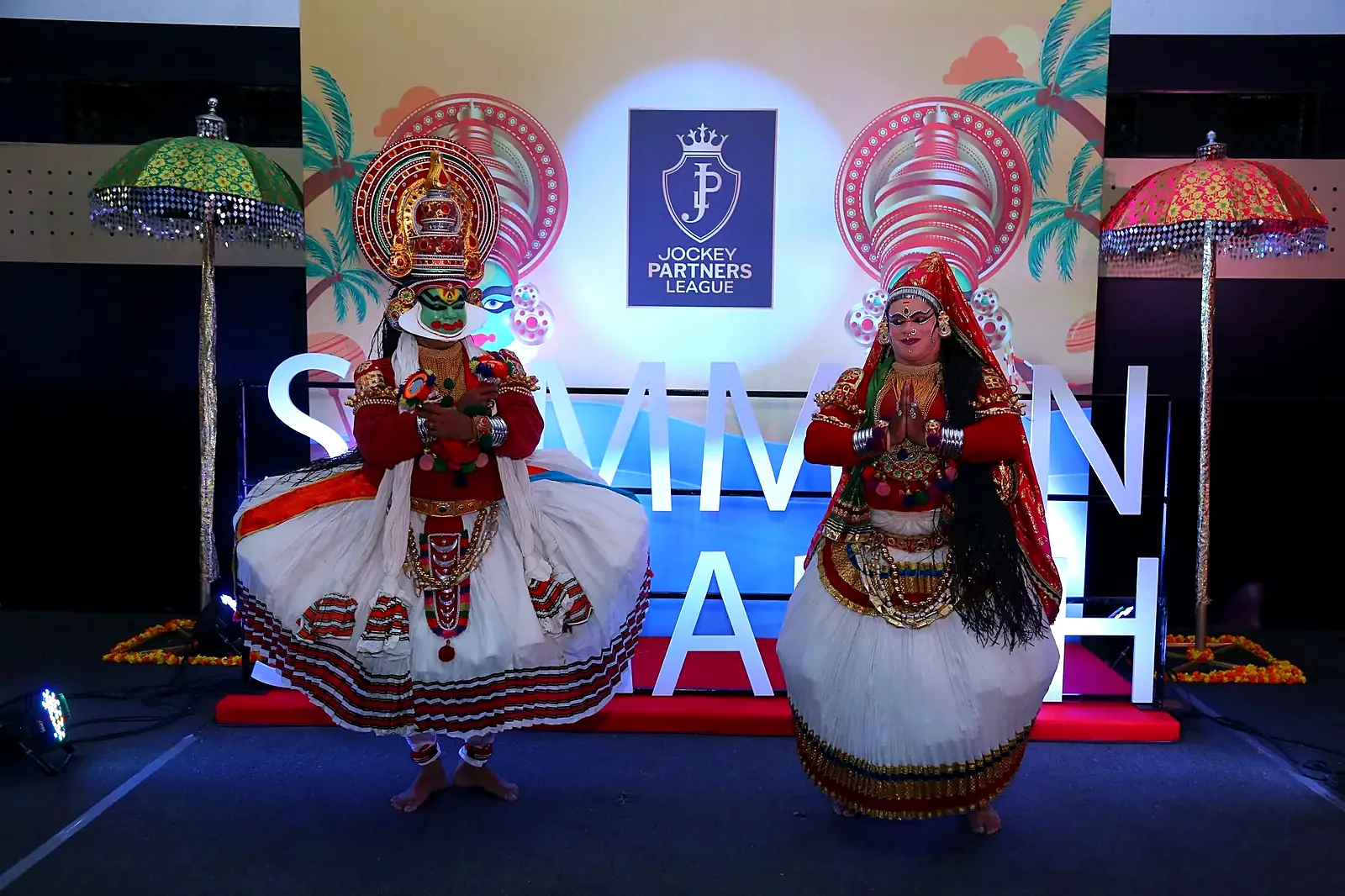
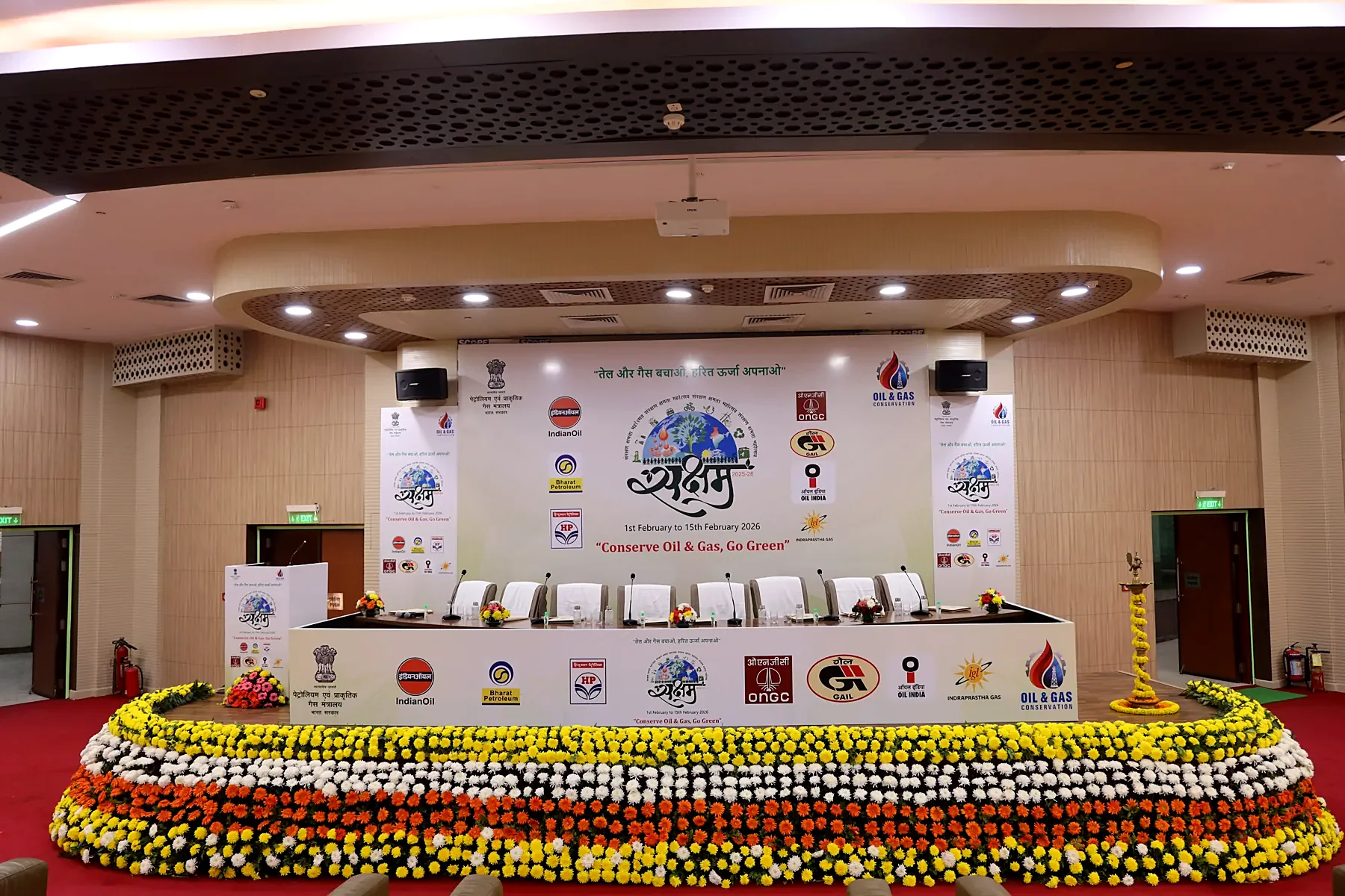
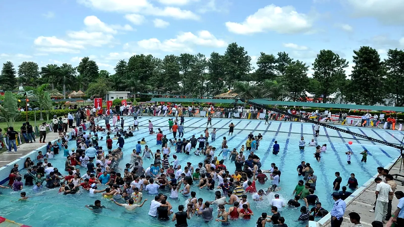
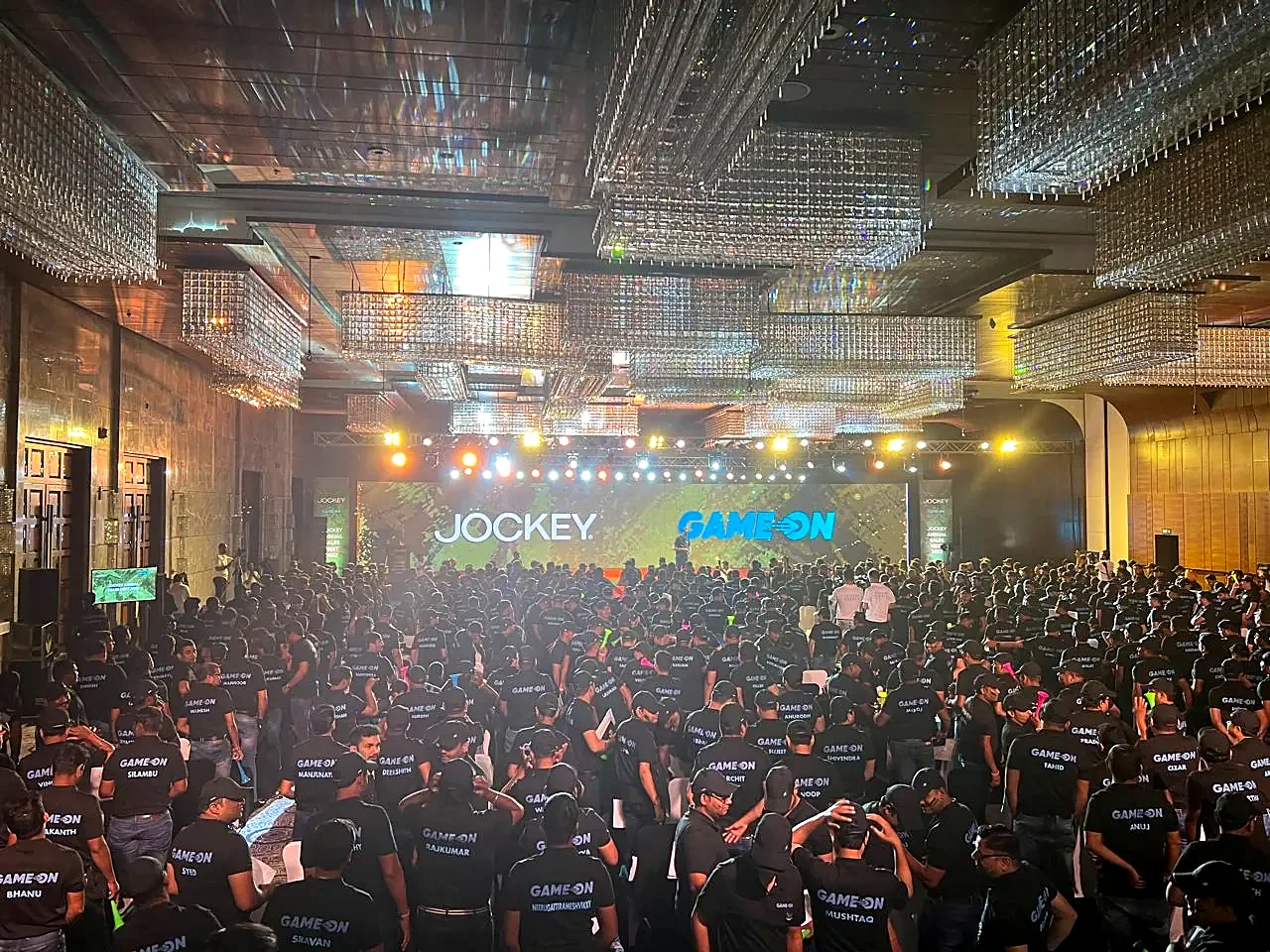
Use
- Our own events, never stock
- Wide shots that show scale and light
- People reacting: applause, laughter, lamp lighting
- One strong image per section, shown large
Avoid
- Empty halls and set-up shots
- Filters, colour casts and heavy vignettes
- Text burned into photographs
- Collages of many small pictures
06Layout
Grid
Twelve columns, 24px gutters, margins that grow from 20px on phones to 64px on wide screens. Section labels sit in the first three columns; headlines start at the fourth.
Details
Hairline rules separate content. Photographs and cards have 12px corners; buttons and the header are pills. Logo Blue appears in wide bands, echoing the logo; Magenta stays a small accent.
07Motion
Principles
Motion explains a change and then gets out of the way. The home page leaves a trail of event photos behind the cursor, draws three river lines that become the three bands of the logo, moves the selected work sideways and builds the logo across the footer. Scroll scenes are scrubbed so the visitor stays in control; entrances are short (0.6–0.9s) on one shared curve.
Reduced motion
When a visitor asks for reduced motion, every scene becomes a still layout with the same content: no pinning, no autoplay, no parallax.
08Voice
How we write
Plainly and specifically. Real numbers, real names, real places. Confident because the work is proven, warm because events are about people.
Example
We deliver world-class, end-to-end event solutions.
1000 guests in Goa, a Kathakali opening and an awards night, run to the minute.
09Website
Built for
Marketing heads, sales and HR leaders, ministry and PSU officials who need to know quickly whether we can carry their event. The site leads with real footage and real clients, then gets out of the way: every page ends in a phone number, an email and a five-question brief that goes straight to WhatsApp.
Standards
- WCAG 2.2 AA: keyboard access, visible focus, captions on media
- Images in WebP with mobile sizes and fixed dimensions
- First view under 1.5 MB on mobile
- Content edited in one file, src/data.mjs